Wednesday, 20 February 2008
Bibliography
Books
Bright S, (2005) Art Photography Now, Thames and Hudson Ltd, London
Sigismondi F, (2005) Immune, Gestalten Verlag,
Websites
http://www.directessays.com/viewpaper/11380.html
http://www.electroboy.com/electroshocktherapy.htm
www.floriasigismondi.com
http://profile.myspace.com/index.cfm?fuseaction=user.viewprofile&friendid=48248436
www.Wikipedia.org
http://www.yorkshireeveningpost.co.uk/news/Memories-of-a-city-insti
www.youtube.com
Evaluation
I worked in a group with Holly Crossley and Sarah Vo to create a video with slightly disturbing qualities, blurring the boundaries between dream and reality. We wanted a to achieve a certain sense of ambiguity and mystery within our video, to allow the audience to make their own interpretations. This engages the audience a lot more, as seen in the case of Eraserhead’s many different interpretations for example. The main concentration for the video was surrealism and creating an unsettling atmosphere. We wanted focus on connotations of isolation, seclusion, detachment, separation, loneliness and emptiness.
We were able to find the perfect location for our video through researching on websites such as secret Leeds and Flickr. West Riding Pauper Lunatic Asylum, now known as High Royds. On a personal level this location interested my greatly, having studied the Sociology of mental illness previously. I researched further into the history of the site and was extremely interested to discover John, a security guard at Liberty Park, who had worked there for 30 years. John was happy to share his memories of High Royds with us and he spoke fondly of it, which surprised me as I assumed a job like this would be quite upsetting at times.
As a group of three we were able to work very closely together easily collaborating ideas and contributing evenly to the video. Organisation was a struggle at times but I am very happy with the outcome of our video. If I was to repeat this module I would have attempted to explore High Royds more thoroughly, unfortunately this was impossible without permission to be on the site. If this had been achievable our footage would have been more varied. We also may have been able to hint at where the child is as this is not entirely clear in our video. However I do like the mystery this generates. Also if we had more time we would liked to have presented a contrasting environment within the film, the moors for example to really emphasize the feeling of confinement and overruling power associated with the hospital.
The storyboard created was quite limited and not particularly detailed. This was because we chose not to have an obvious linear narrative. We also did not have a complete in-depth overview of the location and therefore did not know what to expect until it came to filming on the day. However I do not consider this a weakness as we did have some initial general ideas that provided a basis to expand on whilst on location.
After arriving at our location with all our filming equipment it quickly became apparent that it would be unfeasible to use a tripod. This was due to our strict time constraints, as we did not receive permission to be on the premises, and the fact that it could not be easily moved around the uneven ground. This forced us into handholding the camera to film. However I believe this decision worked very much to our advantage. We considered more interesting camera angles and frames to shoot. Within some of the clips we were able to achieve a jerky quality to the video, due to the camera being handheld, which related back to the research into the White Stripes video for Blue Orchid and aided our aim to create a surreal and unsettling mood to the video.
The decision was made not to use stop frame. This was because we had limited time at the location. We also came to the conclusion that it would not fit in to the overall style of our video. We felt jump cuts and possibly still frames would be more effective in creating psychotic connotations.
I feel Gregory Crewdson affected the mise en scene of our film greatly. His extremely effective use of lighting and colour are fundamental in creating his scenes. Considering the ideal lighting for our film was essential. We filmed using daylight on quite a bright day. This produced a lovely contrast between the bright sunshine and the darkness of the rooms. It also revealed the pale monochromatic shades of the walls and floors, which helped connote a sense of emptiness, loneliness and gave it a more impersonal and neglected feel.
The straight lines of the corridors, doors and windows contrast well with the girl’s flowing dress, the roundness of her mask and her marbles.
The child wearing a gas mask provides a troubling image. Gas masks are associated with war, violence and dark times. It also offers connotations of hidden identity, isolation and seclusion. The child is trapped, unable to breathe. Perhaps she is in an environment that is toxic to her health, trying to protect herself. This relates back to my interest in the Sociology of mental health and historical debates over how people with mental illnesses are treated and the environment in which they are exposed to within hospitals. The choice to use a gas mask was also heavily influenced by Floria Sigismondi and how she used them to create a surreal fantasy dream-like state.
We chose Sarah to be the girl in our video because she is quite petite and could pass as childlike. She wore a white dress to connote innocence, purity and clarity, which would contrast with the scene in which she appeared and also the atmosphere we were trying to create.
Various editing techniques were used throughout our video. We used jump cuts to create rapid and jerky movement between frames. This was inspired by Floria Sigismondi’s White Stripes video. It can be seen in the scene on the stairs with the blanket. It gives the impression of repetition and connotations of insanity. We also changed the speed in quite a lot of our clips, speeding up and slowing down. The emphasized the girls movements and helped to create the creepy and surreal atmosphere we were after. There is a particular scene that I love in which the girl is standing at the end of the corridor, the shot is very wide and she is barely visible. We slowed the clip down so much that you can’t clearly tell whether she is moving or not. It almost looks as though it could be a still frame. Then she begins to skip towards the camera. This is quite unexpected and strange, creating an unsettling mood.
A lot of the shots are full body, long shots and wide shots. These seemed to work best as they emphasized connotations of loneliness and emptiness. Also having the girl walking in and out of the frame created similar connotations.
We did use some close ups and extreme close up shots. The intention of these shots was to shock the audience. For example in the beginning we are introduced to girl for quite a while. We have establishing shots of the building then we move to close ups of the girl’s feet. As the shots become wider we see the back of the girl is a dark room and as she slowly turns round her mask is visible against the bright window. We also used close ups of the mask to startle the audience.
Another effective clip is the scene with the girl and the marbles. We reversed the footage and found the movements became strange and surreal. Playing with the marbles relates to the idea of childlike innocence and purity. I love the low angle we used for this. I think it is very effective in generating an unusual overall image.
Layers were used again to connote repetition and insanity. It gives the impression the girl wanders round the same places again and again perhaps unaware of what she is doing.
We used cross fades and fades in and out so our video flowed smoothly. However these techniques were not used on all our clips, as we wanted a rough erratic feel to effectively achieve the troubling images we needed.
The soundtrack chosen was An Ending (Ascent) by Brian Eno. This was also featured in the film 28 Days Later. We chose this music as it is quite slow, soft and calm, which we thought would contrast well with the disturbing subject matter and create quite a surreal mood. This idea was inspired by the use of music in Eraserhead. The music is quite dramatic and eerie which will fulfil our need to create surrealism within the video. We were able to comfortably fit all the clips we wanted into the time frame of the track. We needed a track with no lyrics, firstly so as not to distract from the visuals and atmosphere of the film and secondly to flow smoothly with our voiceover.
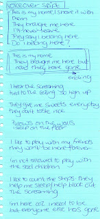
A voiceover has provided our video with an underlying narrative. It has no particular structure or order to it, it merely hints at a story behind the images. We wrote a script for the voiceover, which drew upon some experiences that John had shared with us from his memories of working at High Royds Hospital. His stories were so engaging that we decided they should be part of the video. It became another aim of our video to get across feelings patients might have had whilst living in this hospital. Our decision to use a child’s voice (Sarah’s cousin) was an attempt to engage the audience emotionally. We have provided them with a character to relate to and care for. One line of the script ‘they give me sweets everyday but they don’t taste nice’ was included as a drug reference to patients being forced full of drugs. There are also references to being trapped and enable to escape, deaths within the hospital and treatment of the patients.
The fact that we recorded the voice over the phone I think adds an interesting impact to the sound. The voice is slightly muffled and distorted adding to the unsettling mood of the video.
After experimenting with the sound we decided to layer original sounds picked up from High Royds together with the music and voiceover. These subtle noises worked well with the music making them appear slightly creepy.
Due to the style and subject matter of the video I believe in an external context it could be placed within an art gallery as an installation as it has an arty feel to it. It could possibly be featured in a film festival as a short horror film. More commercially it could be seen as a music video however I think this might detract from the meaning of the video.
I thoroughly enjoyed this module and feel I have gained valuable experiences from it. Most importantly it has introduced me to the world of Video art and artists, as I have never studied this before and therefore was not familiar with it. I will now consider researching video artists as part of my other modules. Also I have discovered Floria Sigismondi who will continue to inspire me across all of my photography work and encourage me to continue with film outside of modules. Gregory Crewdson has highlighted the importance of spending a lot of time creating the perfect image, something I will consider in future. The skills I have learnt from editing video I believe will help me in the future to edit photographs in a series, considering which photographs work well together. This also works vice versa as my photography skills have helped inform my video skills in terms of framing, camera angles and composition.
Tuesday, 19 February 2008
Editing
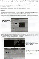
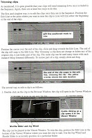
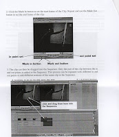
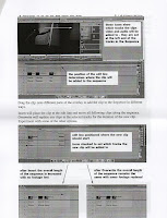
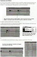
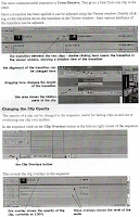
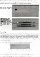
These are some Final Cut notes that i have selected which refer to tools we used during the editing process.
This is a screen grab from towards the end of our editing process. At this point the voice over has not been added so you can only see two layers of sound; the soundtrack and noises recorded at the location.
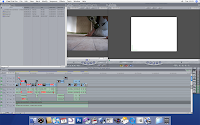
We used a variety of techniques whilst editing such as;
Fade ins
Cross fades
Fade to white
Jump cut
Dissolve
Opacity
Layering


This is a screen grab from towards the end of our editing process. At this point the voice over has not been added so you can only see two layers of sound; the soundtrack and noises recorded at the location.

We used a variety of techniques whilst editing such as;
Fade ins
Cross fades
Fade to white
Jump cut
Dissolve
Opacity
Layering
Film Stills and Photographs
Music and Sound
Brian Eno - An Ending (Ascent)
From the 28 days later soundtrack.
Ignore the video, i couldn't find the actual scene the music is featured in but you can get an idea of the track.
We chose it firstly because it has no lyrics and therefore will not distract from the visuals. We wanted the music to be instrumental and add an eerie quality to the video. It is slow and simple yet dramatic and will hopefully complement the scenes in our video.
Another reason why we chose a track with no lyrics was because we intend to use a voiceover throughout the video.
Voiceover
We have chosen to use the voices of Sarah's cousins, Nicola and Lucy who are both younger than 7. We felt this would give the video more of an emotional impact. It is more personal and therefore the audience can connect to the character. We all wrote a script for the girls to read which will consist of memories and experiences of living in a mental hospital. We collected some of these memories from John, a security guard at Liberty Park who worked at High Royds for 30years.

Production Diary
Video production diary
Week one
Our group began to brainstorm ideas for a new and exciting piece of video art. To start off we thought of ideas of what we would all like to achieve within the film. We then came to the conclusion of basing our short film on the themes of sadness and isolation. We wanted to make a piece of video which the audience could empathize with which would be moving and engaging. Then from looking and researching on the internet we came across High Royds mental lunatic asylum which is currently derelict. Therefore it gave connotations of emptiness, abandonment and neglect which were concepts that would perfectly match our desired approach.
Week two
In week two we began to think about visiting this derelict building to find out whether it was safe, suitable and stable to film within the premises. A few days later we returned with filming equipment, props and a good outlook on filming. Whilst filming we had limited time so setting up would be difficult because we didn’t really have permission to be there. After filming all we could in that particular building we set off to explore the main building. However unfortunately we got chased by contractors and we were forced to leave the premises due to it being private property, but luckily we had plenty of footage to work with.
Week three
Week three consisted of editing our film. We first started off by choosing as a group, clips that we liked and started to assemble these clips into a roughly ordered sequence. This made the process of editing a lot easier. We made a mental-paper-edit which aided us in choosing the appropriate and best footage. We needed to fulfill every team members visual ideas. We did this by discussing each clip carefully and abandoning the unwanted footage. Once we had chosen the footage we began to experiment with the order, effects and sound of the short film before layering our sound track and voice over.
Subscribe to:
Comments (Atom)


